Retail Signage 101 - The Basics of Good Signs
Every Retailer Knows - Signs Do Sell! But research shows that Good Signs Sell More!
Tests show that the best use of Point-of-Purchase (POP) signs is the Price-Plus-Benefit template or layout. Research showed that retail sales had an average increase of 26% through the use of descripttive signs. Combined with information that shows an average of 56% increase in product sales when using a printed sign compared to a handwritten sign demonstrates the value of a professional looking sign.
These best practice suggestions are ways to increase your sales using retail sign making software like SignHarbor or any other retail or grocery signage system.
Point-of-Purchase Sign Basics
Sign Size - Larger signs do get a customers attention, but at the potential cost of product facing. Smaller signs with mutltiple small font sizes help customers see benefits of a product from the features displayed on the sign.
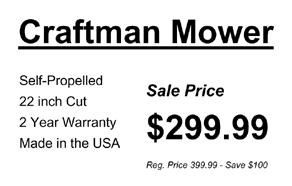
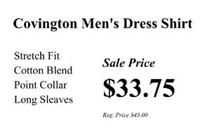
Typeface, Typestyle, and Fonts - Use stronger, more bold typeface when merchandising hardlines products. Apparel and luxury products should use a lighter, less bold typeface. Here is an example:


Serifs, the little "ends" on characters, are found on typeface styles like Times New Roman and are prefered by many department and discount stores because it looks good in both standard and bold font. This makes it ideal for both hardlines and softlines depending on the strenght of the characters.
Layouts and Templates - The arrangement of content (brand, tagline, features, UPC) and price on a POP sign is called a layout (or template). Many stores use a standard layout around the store to help customers quickly read and understand the information being presented, regardless of store department or sign size.

Standard POP Sign layouts are based on customer's reading habits and are designed to read as quickly as possible. Standardizing on a template or two will help your customers be smarter shoppers and help your sign coordinator produce POPS signs more effectively.
Balance, Proportion, and Dominance - The principles of sign layout are similar to advertising layout. Consider the balance of white space relative to sign elements. Avoid lopsided signs by having too much print or too much white. Look at the sign without reading details and ask if the sign is aesthetically pleasing.
Font size should relate to each other on the same sign. This will give the sign a sense of proportion. Use a limited number of font sizes that are relatively close to each other on a sign.
Something on the sign should stand out, or take dominance. Idealy, there should only be one dominante element on the sign (not the price! - you customers will find that). Sign elements should tell your customers What-Why-How Much. The What will get the customers attention and should take dominance. A simple attention getting statment. The Why are features displayed on the sign in a smaller font once you have the customer's attention. Features that releate to benefits will motivate a customer to buy more than the price. The How Much is the price with a font smaller than the dominate sign element.
Signs for Impulse Purchases
Signs are used strategically to help manage inventory and sales velocity. Here are a few tips to consider:
Tip 1 - Give priority to seasonal products. With only a few months to sell certain items, use POP signs with seasonal features and benefits in high traffic areas. Remember, seasonal products are impulse purchase because they are not purchased frequently.
Tip 2 - Show what's new. Many brands have multiple UPCs for a product family and when you have limited shelf space, signs can help determine which specific UPC suits your customer's needs or desires. Use signs to help determine how much product to shelf and which "flavors" to offer. Endcaps are the best place in the store to promote (test) new products with signs. Avoid price-only signs since they can tell you nothing about customer's buying habits.
Tip 3 - Private Label. Use a two product POP sign layout to sell a timely commodity (AA and AAA batteries during the holiday season). Compare the benefits of both the Private Label and National Brand to show the added value of your product in addition to the lower price. Let the customer know the price is lower, but the product is not "cheaper".
Tip 4 - Show what's needed, when needed. Remind the painter of all the necessary items needed for a successful paint job. Remind the baker of the all the ingredients necessary for the perfect pastry. These are excellent opportunities to cross-merchandise. This is very useful during holiday seasons when customers need help to remember everything on the "to-do" list. Use the POP sign to help customers find other products within the store that they need.
Effective Retail Sign Content
The attention span of your customers is measured in milliseconds. In today's world of Google, Facebook, and Twitter, consumers are processing information faster than ever before. Thus, brevity is wisdom. Here are a few rules to consider when creating sign elements:
Rule 1 - Be Specific. Generic advertising terms do not have the impact as they did in the past. Instead of Sale on Winter Boots!, try Cold Outside? Try our Boots!
Rule 2 - Easy to Read Pricing. If a customer thinks they got a deal at the point-of-purchase because of a sign, they should feel the same way at the check out. Make sure your pricing on the sign is simple enough that a child can understand.
Rule 3 - Sell the Story. If your products have a unique story about them like a local company, a new start-up, or social awareness, make your customers aware of it. Give some of your products a special story.
Rule 4 - Push Facts. Give details about the products features in numbers. The line 30% Less or 30% More captures the customer's attention quicker than subjective words like So Much Less or So Much More.
Rule 5 - Explain the Product. Help the customer understand how a product works or present step-by-step instructions. Modern packaging of products or techniques of food preparation can be confusing. Help customers understand how to take advantage of new technologies.
Rule 6 - Compare Products. Help your customer make a decision on which product best fits their needs. Use a two product POP sign to highlight each products features and benefits to help the customer make a buying decision.
Rule 7 - Be Kind. Sometime we have to tell customers the rules. Instead of No Shirt, No Shoes, No Service... Try Shirt and Shoes Require by Law - Thanks!
